Tutorial 7: Build and Visualize Hi-M Contact Matrices
Objective
Convert chromatin traces into pairwise distance matrices and contact probability matrices, then visualize them as publication-quality heatmaps.
This tutorial covers two scripts:
``trace_to_matrix`` — computes single-cell pairwise distance (PWD) matrices from a trace file and produces four plots by default (Hi-M contact matrix, PWD median, PWD KDE, N-matrix). The all-pairs distance histogram plot is optional because it can dominate runtime for large barcode sets.
``plot_him_matrix`` — re-plots a Hi-M matrix from the saved
.npydata with custom options (colormap, color range, mode, triangular display, NaN threshold…).
Scientific context
Contact matrices summarize pairwise interactions across all traces:
Contact probability (Hi-M): fraction of traces where two barcodes are closer than a distance threshold (default 0.25 µm).
PWD median / KDE: ensemble pairwise distance estimated via median or kernel density peak.
N-matrix: number of valid (non-NaN) measurements per barcode pair — reveals data coverage.
These matrices reveal chromatin folding patterns such as topologically associating domains (TADs), long-range loops, and compartments.
Input
We use the Pdx1-positive trace file produced by Tutorial 6 (mask assignment + split):
File |
Description |
|---|---|
|
Traces inside the Pdx1 mask (single ROI) |
[1]:
import os
import matplotlib.pyplot as plt
import matplotlib.image as mpimg

data_path = "/home/devos/Documents/data_to_compare_pdx1/PDX1"

# Pdx1-positive traces from Tutorial 6
input_trace = f"{data_path}/merged_traces_split.ecsv"

# Base name for all matrix outputs
matrix_base = f"{data_path}/merged_traces_split_Matrix"

print(f"Input trace: {input_trace}")
Input trace: /home/devos/Documents/data_to_compare_pdx1/PDX1/merged_traces_split.ecsv
Step 1: Build matrices with trace_to_matrix
trace_to_matrix reads a trace file and computes:
A 3D single-cell PWD matrix (shape: n_barcodes × n_barcodes × n_traces) saved as
.npyAn N-matrix (count of valid measurements per barcode pair) saved as
.npyA unique barcodes list saved as
.ecsvFour default plots: Hi-M contact matrix, PWD median, PWD KDE, and N-matrix
An optional distance histogram plot (
*_Matrix_PWDhistograms.png) when--plot_histogramsis passed
Parameters
Option |
Default |
Description |
|---|---|---|
|
— |
Input trace file (ECSV) |
|
|
Maximum distance allowed (discard pairs beyond this) |
|
|
Output folder (for data files) |
|
|
Parallel workers for per-trace PWD matrix construction ( |
|
disabled |
Also calculate and save all-pairs PWD KDE histograms. This is skipped by default because it is often the slowest step. |
[ ]:
!trace_to_matrix --input {input_trace}

# Optional: add --plot_histograms if you also need the all-pairs PWD KDE histogram figure.
# This can be slow for large barcode sets.
# !trace_to_matrix --input {input_trace} --plot_histograms
Output files
All outputs use the pattern <input_basename>_Matrix_<suffix>:
File |
Format |
Description |
|---|---|---|
|
NumPy binary |
3D single-cell pairwise distance matrix |
|
NumPy binary |
2D N-matrix (data coverage) |
|
Text |
List of unique barcode IDs |
|
Image |
Contact probability heatmap |
|
Image |
PWD matrix (median) |
|
Image |
PWD matrix (KDE peak) |
|
Image |
N-matrix heatmap |
|
Image |
Optional distance histograms for all barcode pairs; only produced with |
Step 2: Hi-M contact probability matrix
The Hi-M matrix shows the fraction of traces where each barcode pair is closer than a distance threshold (default: 0.25 µm). Higher values (warm colors) indicate more frequent contacts.
[3]:
img = mpimg.imread(f"{matrix_base}_HiMmatrix.png")
fig, ax = plt.subplots(figsize=(10, 8))
ax.imshow(img)
ax.axis('off')
ax.set_title("Hi-M Contact Probability Matrix", fontsize=14)
plt.tight_layout()
plt.show()
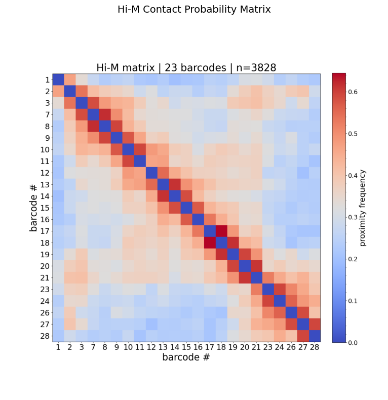
How to read this matrix:
Axes show barcode IDs (genomic loci along the chromatin fiber).
The diagonal is always high (a barcode is always close to itself).
Off-diagonal warm spots indicate frequent spatial proximity between distant genomic loci → potential loops or TAD boundaries.
Blocks along the diagonal suggest topologically associating domains (TADs).
Step 3: Pairwise distance matrices
Two PWD representations are computed:
Median: robust central tendency of 3D distances per barcode pair.
KDE: peak of the kernel density estimate — captures the most probable distance, useful when distributions are skewed.
[4]:
fig, axes = plt.subplots(1, 2, figsize=(20, 8))

for ax, suffix, title in zip(
    axes,
    ["_PWDmatrixMedian.png", "_PWDmatrixKDE.png"],
    ["PWD Matrix (Median)", "PWD Matrix (KDE)"]
):
    img = mpimg.imread(f"{matrix_base}{suffix}")
    ax.imshow(img)
    ax.axis('off')
    ax.set_title(title, fontsize=14)

plt.tight_layout()
plt.show()
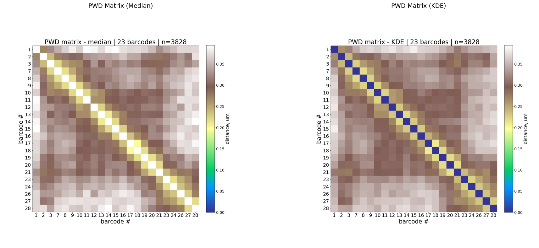
Interpretation:
Low values along the diagonal (warm colors in
terraincolormap) = nearby genomic loci are physically close (expected).Off-diagonal low-distance spots indicate long-range contacts.
KDE is often less noisy than median for sparse data.
Step 4: N-matrix and distance histograms
The N-matrix shows how many valid (non-NaN) pairwise measurements exist for each barcode pair. Low N values indicate poor coverage — those entries should be interpreted with caution.
The optional distance histograms show the full distribution (KDE) of 3D distances for every barcode pair. Because this figure can be much slower than the matrix outputs, it is not produced by default. Re-run Step 1 with --plot_histograms if you need it before executing the display cell below.
[ ]:
fig, axes = plt.subplots(1, 2, figsize=(20, 8))

plot_specs = [
    ("_Nmatrix.png", "N-matrix (data coverage)", True),
    ("_PWDhistograms.png", "Pairwise Distance Histograms", False),
]

for ax, (suffix, title, produced_by_default) in zip(axes, plot_specs):
    file_name = f"{matrix_base}{suffix}"
    if produced_by_default or os.path.exists(file_name):
        img = mpimg.imread(file_name)
        ax.imshow(img)
    else:
        ax.text(
            0.5,
            0.5,
            "Optional histogram output not found.\nRe-run Step 1 with --plot_histograms to create it.",
            ha="center",
            va="center",
            fontsize=12,
        )
    ax.axis('off')
    ax.set_title(title, fontsize=14)

plt.tight_layout()
plt.show()
Step 5: Re-plot with plot_him_matrix
plot_him_matrix lets you re-visualize a previously computed matrix with custom display options, without re-running the full computation.
It reads:
The 3D single-cell PWD matrix (
*_PWDscMatrix.npy)The unique barcodes list (
*_uniqueBarcodes.ecsv)
Key parameters
Option |
Default |
Description |
|---|---|---|
|
— |
Single-cell PWD matrix ( |
|
— |
Unique barcodes file |
|
|
|
|
|
Contact distance threshold in µm (for |
|
auto |
Colormap range |
|
|
Matplotlib colormap name |
|
|
Mask bins where NaN percentage exceeds this value (0–1) |
|
off |
Show only upper or lower triangle |
|
|
|
|
|
Output folder for the plot |
|
|
|
Example: proximity matrix with custom threshold
Recompute the contact probability using a different distance threshold (e.g. 0.30 µm instead of the default 0.25 µm):
[6]:
sc_matrix = f"{matrix_base}_PWDscMatrix.npy"
barcodes = f"{matrix_base}_uniqueBarcodes.ecsv"

!plot_him_matrix -M {sc_matrix} -B {barcodes} --mode proximity -T 0.30 -O {data_path}/plots
Output path: /home/devos/Documents/data_to_compare_pdx1/PDX1/plots
$ Matrix loaded: /home/devos/Documents/data_to_compare_pdx1/PDX1/merged_traces_split_Matrix_PWDscMatrix.npy
$ Unique barcodes loaded: [1, 2, 3, 7, 8, 9, 10, 11, 12, 13, 14, 15, 16, 17, 18, 19, 20, 21, 23, 24, 26, 27, 28]
$ averaging method: proximity
$ calculating contact probability matrix
Output data: /home/devos/Documents/data_to_compare_pdx1/PDX1/plots/Fig_merged_traces_split_Matrix_PWDscMatrix_proximity_norm_T0.3_0.31-0.75.npy
[7]:
import glob
plots_path = f"{data_path}/plots"

matches = sorted(glob.glob(f"{plots_path}/Fig_*_proximity_norm_T0.3_*.png"))
if matches:
    img = mpimg.imread(matches[0])
    fig, ax = plt.subplots(figsize=(10, 8))
    ax.imshow(img)
    ax.axis('off')
    ax.set_title("Proximity matrix (T = 0.30 µm)", fontsize=14)
    plt.tight_layout()
    plt.show()
    print(f"Plot: {matches[0]}")
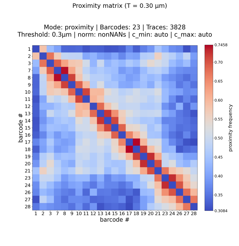
Plot: /home/devos/Documents/data_to_compare_pdx1/PDX1/plots/Fig_merged_traces_split_Matrix_PWDscMatrix_proximity_norm_T0.3_0.31-0.75.png
Example: median PWD matrix
[8]:
!plot_him_matrix -M {sc_matrix} -B {barcodes} --mode median -O {data_path}/plots
Output path: /home/devos/Documents/data_to_compare_pdx1/PDX1/plots
$ Matrix loaded: /home/devos/Documents/data_to_compare_pdx1/PDX1/merged_traces_split_Matrix_PWDscMatrix.npy
$ Unique barcodes loaded: [1, 2, 3, 7, 8, 9, 10, 11, 12, 13, 14, 15, 16, 17, 18, 19, 20, 21, 23, 24, 26, 27, 28]
$ averaging method: median
/home/devos/Repo/traceratops/.venv/lib/python3.11/site-packages/numpy/lib/_nanfunctions_impl.py:1215: RuntimeWarning: All-NaN slice encountered
  return fnb._ureduce(a, func=_nanmedian, keepdims=keepdims,
Output data: /home/devos/Documents/data_to_compare_pdx1/PDX1/plots/Fig_merged_traces_split_Matrix_PWDscMatrix_median_norm_0.20-0.40.npy
[9]:
matches = sorted(glob.glob(f"{plots_path}/Fig_*_median_norm_*.png"))
if matches:
    img = mpimg.imread(matches[0])
    fig, ax = plt.subplots(figsize=(10, 8))
    ax.imshow(img)
    ax.axis('off')
    ax.set_title("PWD Median matrix", fontsize=14)
    plt.tight_layout()
    plt.show()
    print(f"Plot: {matches[0]}")
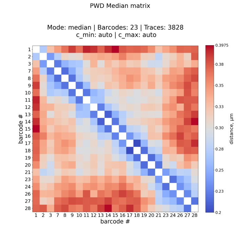
Plot: /home/devos/Documents/data_to_compare_pdx1/PDX1/plots/Fig_merged_traces_split_Matrix_PWDscMatrix_median_norm_0.20-0.40.png
Summary
Workflow
trace file (.ecsv)
       │
       ▼
trace_to_matrix              →  4 default plots + 3 data files
                              →  optional PWD histograms with --plot_histograms
       │
       ▼
plot_him_matrix (optional)   →  re-plot with custom options
Produced by trace_to_matrix
Plot |
What it shows |
|---|---|
|
Contact probability (proximity frequency) |
|
Pairwise distance — median |
|
Pairwise distance — KDE peak |
|
Data coverage (N measurements per pair) |
|
Optional full distance distributions (all pairs; produced with |
Customization with plot_him_matrix
Use case |
Command |
|---|---|
Change distance threshold |
|
Median distance matrix |
|
KDE distance matrix |
|
Custom colormap |
|
Mask sparse bins |
|
Triangular plot |
|
PDF for publication |
|