[1]:
import matplotlib.pyplot as plt
import matplotlib.image as mpimg

# Data path from Tutorial 1
data_path = "/home/devos/Documents/data_to_compare_pdx1/PDX1"
dest_path = f"{data_path}/"

# Input file from Tutorial 1
input_trace = f"{dest_path}/merged_traces.ecsv"

print(f"Input file: {input_trace}")
print(f"Output folder: {dest_path}")
Input file: /home/devos/Documents/data_to_compare_pdx1/PDX1//merged_traces.ecsv
Output folder: /home/devos/Documents/data_to_compare_pdx1/PDX1/
Tutorial 2: Quality Control Analysis of Merged Chromatin Traces
Before filtering or downstream analysis, assess your data quality through comprehensive statistical analysis.
trace_analyzer computes:
Trace Statistics: Distribution of barcode counts per trace
Barcode Detection: How reliably each barcode is detected (bootstrap analysis)
Neighbor Distances: Spacing between consecutive barcodes (ΔX, ΔY, ΔZ)
Barcode Frequencies: How often individual barcodes appear
Spatial KDE Projections: Density heatmaps showing where spots are located in X, Y, Z
These metrics guide filtering decisions in Tutorial 3.
Step 1: Run Quality Control Analysis
[2]:
# Run trace_analyzer for detailed quality metrics
!trace_analyzer --input {input_trace}
1 trace files to process= /home/devos/Documents/data_to_compare_pdx1/PDX1//merged_traces.ecsv
$ Importing table from pyHiM format
Successfully loaded trace table: /home/devos/Documents/data_to_compare_pdx1/PDX1//merged_traces.ecsv
> Analyzing traces for /home/devos/Documents/data_to_compare_pdx1/PDX1//merged_traces.ecsv
$ Number of spots in trace file: 31407
$ Calculating overall barcode detection across 3388 traces...
$ Exporting barcode detection plot to: /home/devos/Documents/data_to_compare_pdx1/PDX1//merged_traces_barcode_detection.png
$ Saved neighbor distances plot: /home/devos/Documents/data_to_compare_pdx1/PDX1//merged_traces_first_neighbor_distances.png
$ Mean distances between neighboring barcodes: X=-0.000, Y=-0.001, Z=-0.021
$ Calculating barcode stats...
$ Exporting relative barcode frequencies figure to: /home/devos/Documents/data_to_compare_pdx1/PDX1//merged_traces_relative_barcode_frequencies.png
$ Saved KDE projection plot: /home/devos/Documents/data_to_compare_pdx1/PDX1//merged_traces_kde_projections.png
Finished execution
Step 2: Barcode Detection Efficiency
[3]:
plot_file = f"{dest_path}/merged_traces_barcode_detection.png"
img = mpimg.imread(plot_file)
fig, ax = plt.subplots(figsize=(14, 6))
ax.imshow(img)
ax.axis('off')
plt.tight_layout()
plt.show()
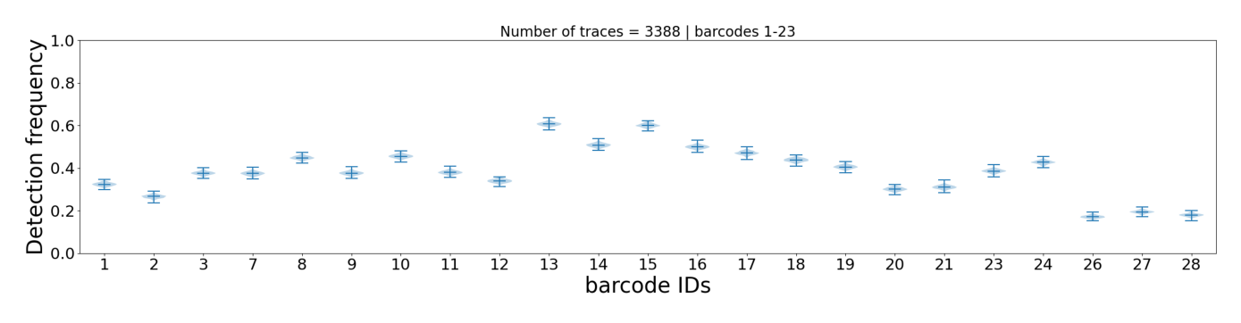
This plot shows how often each individual barcode is detected across all traces. Each barcode is represented by a violin plot (bootstrap distribution with 1000 iterations), which shows:
Height of the violin: Range of detection frequencies (0-100%)
Median line: Most common detection frequency
Shape: Distribution shape indicates consistency
Interpretation:
Narrow violin = reliable barcode (consistent detection)
Wide violin = unreliable barcode (variable detection)
Barcodes with very low median detection may be candidates for
--remove_barcodein Tutorial 3
Step 3: Neighbor Distance Distribution
[4]:
plot_file = f"{dest_path}/merged_traces_first_neighbor_distances.png"
img = mpimg.imread(plot_file)
fig, ax = plt.subplots(figsize=(14, 6))
ax.imshow(img)
ax.axis('off')
plt.tight_layout()
plt.show()
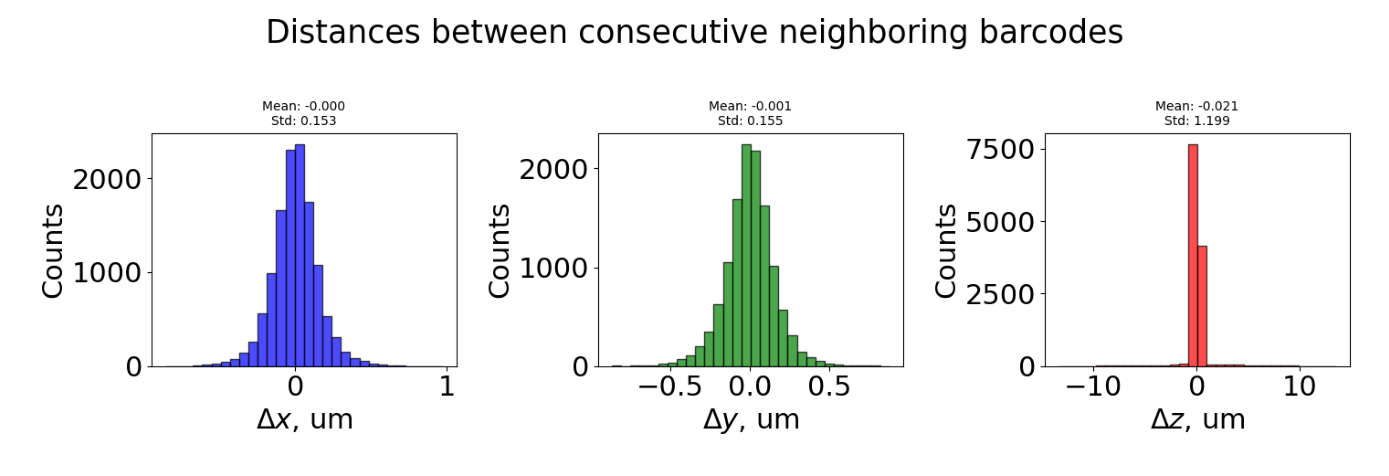
This plot shows distances between consecutive barcodes (barcode_i+1 - barcode_i) for all traces. Three distributions are shown:
ΔX (blue): Distance in X dimension
ΔY (green): Distance in Y dimension
ΔZ (red): Distance in Z dimension (optical axis)
Interpretation:
Bell-shaped, centered near 0 = uniform spacing between barcodes (expected)
Large spread or multiple peaks = inconsistent spacing or detection issues
ΔZ much larger than ΔX/ΔY = potential focusing problems
Step 4: Barcode Repetition Patterns
[5]:
plot_file = f"{dest_path}/merged_traces_relative_barcode_frequencies.png"
img = mpimg.imread(plot_file)
fig, ax = plt.subplots(figsize=(14, 6))
ax.imshow(img)
ax.axis('off')
plt.tight_layout()
plt.show()
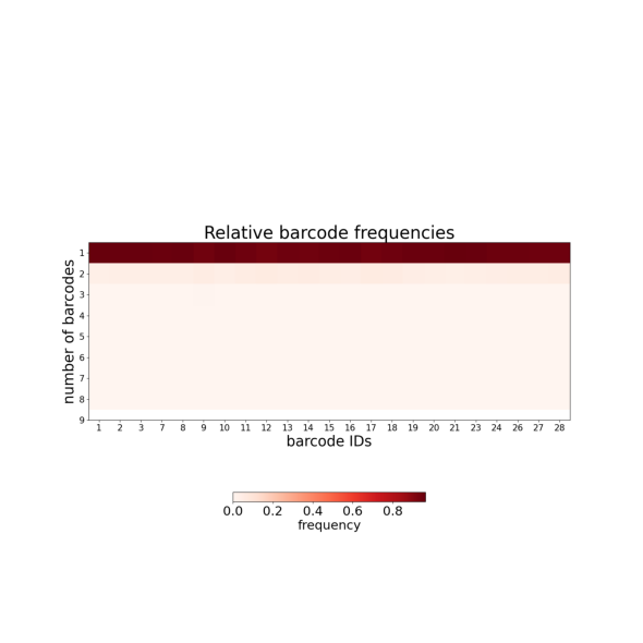
This plot shows how often individual barcodes are repeated within single traces:
Y-axis: Number of times each barcode appears per trace (repetition count)
Near 1 = barcode appears once per trace (ideal)
Toward 2+ = barcode frequently duplicated (optical artifacts or detection noise)
Duplicated barcodes are handled in Tutorial 4 (--clean_spots).
Step 5: Trace Statistics Summary
[6]:
plot_file = f"{dest_path}/merged_traces_trace_statistics.png"
img = mpimg.imread(plot_file)
fig, ax = plt.subplots(figsize=(16, 6))
ax.imshow(img)
ax.axis('off')
plt.tight_layout()
plt.show()
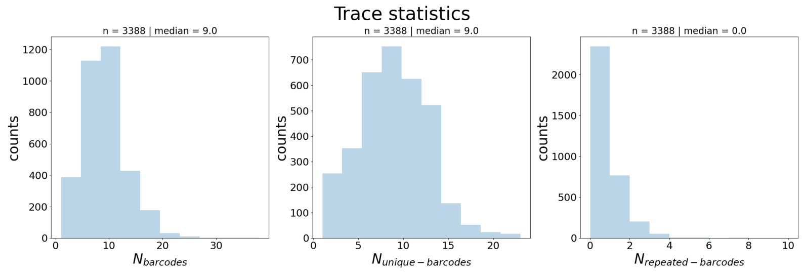
Three distributions across all traces:
N_barcodes (left): Number of barcode detections per trace
N_unique_barcodes (middle): Number of distinct barcodes per trace
N_repeated_barcodes (right): Number of barcodes appearing more than once per trace
Interpretation:
N_barcodes median indicates trace completeness → guides
--n_barcodesthreshold in Tutorial 3N_repeated_barcodes > 0 indicates duplicates → handled in Tutorial 4
Step 6: Spatial Distribution (KDE Projections)
[7]:
plot_file = f"{dest_path}/merged_traces_kde_projections.png"
img = mpimg.imread(plot_file)
fig, ax = plt.subplots(figsize=(14, 10))
ax.imshow(img)
ax.axis('off')
plt.tight_layout()
plt.show()
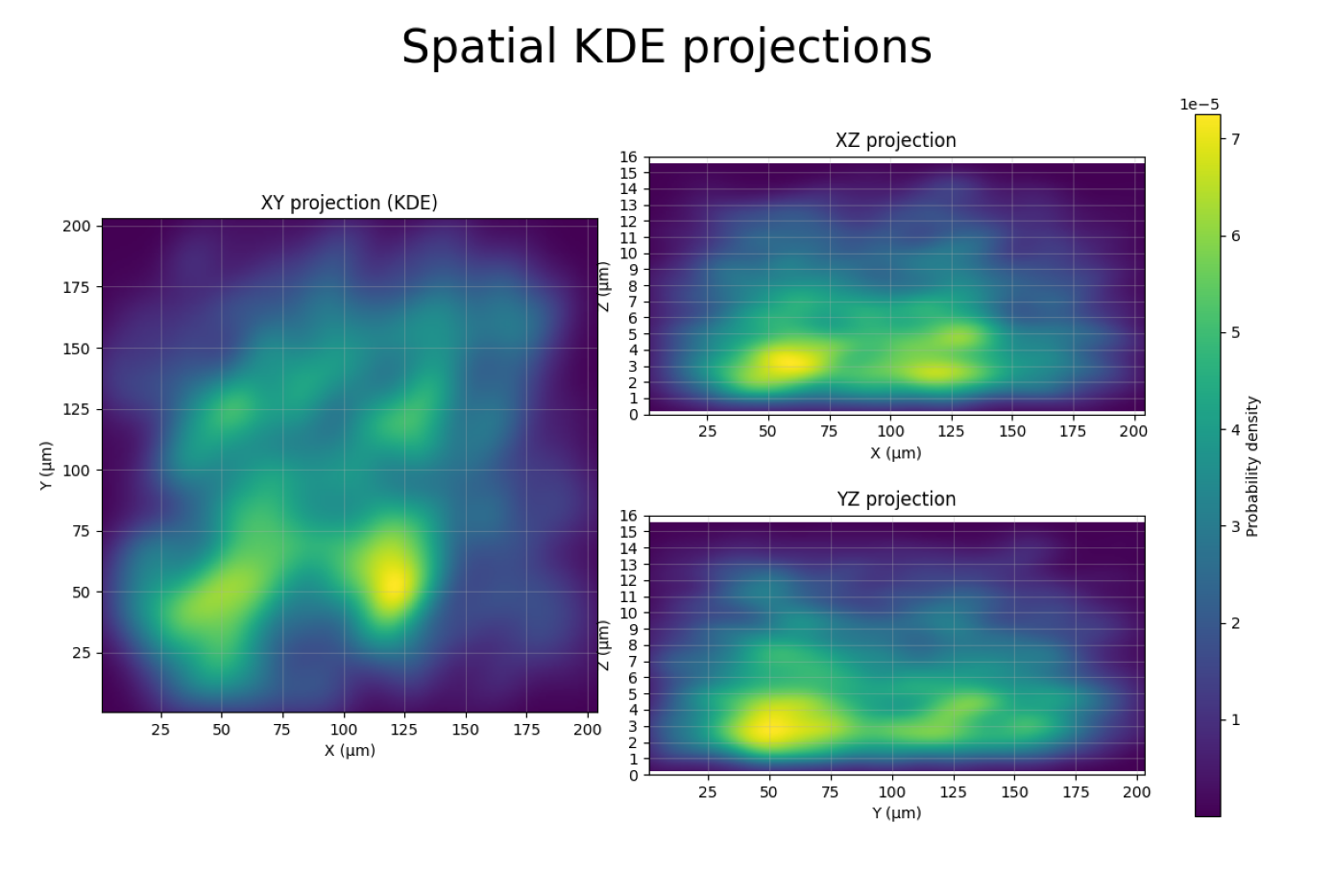
This figure shows kernel density estimation (KDE) heatmaps of all spot positions projected onto three planes:
XY projection (left): Top-down view of the sample. Bright regions = high spot density.
XZ projection (top-right): Side view along Y. Shows the Z range where spots are concentrated.
YZ projection (bottom-right): Side view along X.
How this helps for filtering:
The XZ and YZ panels reveal the usable Z range. If spots concentrate between Z = 3 and Z = 11 µm, you can set
--z_min 3.0 --z_max 11.0in Tutorial 3 to remove out-of-focus outliers.If the XY panel shows spots concentrated in a sub-region, you could use
--x_min/--x_max/--y_min/--y_maxto exclude border artifacts.A uniform XY distribution is normal; clusters may indicate imaging artifacts or biological structure.
Step 7: Using QC Insights for Filtering
From the QC plots above, you can extract key metrics to guide filtering in Tutorial 3:
Plot |
What to Look For |
Filter Option |
|---|---|---|
Barcode Detection |
Barcodes with very low median |
|
Trace Statistics |
N_barcodes median |
|
Trace Statistics |
N_repeated_barcodes > 0 |
|
KDE Projections |
Z range with spot concentration |
|
KDE Projections |
XY border artifacts |
|
Summary
Quality control revealed important characteristics of your merged dataset:
Trace completeness — How many barcodes detected per trace
Barcode reliability — Detection consistency for each barcode
Spatial distribution — Where spots concentrate in X, Y, Z (KDE projections)
Neighbor spacing — Distance characteristics (ΔX, ΔY, ΔZ)
Duplicate barcodes — Repetition patterns across traces
Next: Tutorial 3 — Filter Traces using insights from these QC metrics